


At first I tried using a double sided whammy pedal as a design but I find it hard to put contents into it. Especially this the right side of it. Things weren't really suitable.


So then I thought of doing the one sided. It was better yet it still doesn't solved the problem as it can only contain one category of the magazine.

Double sided whammy pedal

One sided whammy pedal
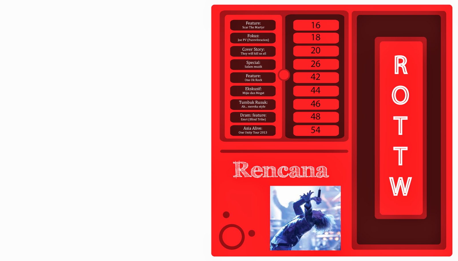
After presented it, Mr. Razif commented that it doesn't represent much of the pedal after adding the images as it is not suitable. Amir asked me to try to do the multiply effect just like the photoshop or maybe just try to make it more realistic looking. Try putting the images at the bottom like the normal typical magazine does.
If this design doesn't go very well, we may need to change the concept. However, we don't really have much alternative of a contents page.
No comments:
Post a Comment