Tuesday, 29 April 2014

Color theme

So using the color 1 from the previous post, this is what I come up with:

color 1

color 2

color 3

Chosen color is color 3.

Monday, 28 April 2014

Idea generation of content page

So yeah… there are many to consider when doing the content page since we are trying to do something different. Apparently we took a few measure and finally decided to do something more typical as of content page in a magazine.

I started out on sketching a few ideas to get a view on how I wanted to make look like. Since I'm in charge of the content page, I'm told that Amir wanted a grunge theme content page as the previous idea didn't work well with the required attribution.


Content monk up #1

Try to make it look like the normal design of a magazine but a little grunge effect layering on top of it. The sides would have the content arrangement and the images will be in lower opacity at the background of the page. 


The color theme I used for the first mock up is this. A color that Amir posted up and will use it in his contents. He suggested that we pick our own theme to work on.


Content monk up #2

I've shown the previous one and it is said that the content page is suppose to be in only one master page. Thinking of keeping the drum theme, I proposed the idea of using the drummer's view instead as it might not work. 


So, I thought about testing the design from the rough sketch and this is what it turned out. The text seems a little too small for reader to read. The images could not match the theme much. Here doesn't have a specific theme in it because the drum is something I edited from google.


content mock up #3

Thought of using a bass guitar. Got the inspiration of Paveethra's idea of doing a gif of a guitarist playing the guitar… but it didn't really turned out nice and suitable either..


content mock up #4

This is actually based on a visual as I was scrolling though the google images. However, I couldn't recall where it is from. Though it is kind of neat in a way and it is contradicting to what we want to do.


However, it turned out quite ok and we finally decided on this theme. The only changes for the contents page now is the color theme. 


This is the color theme I used for the content.

After showing the group, I would have to change the color theme and I try search a few of it. Those are:

color 1

color 2

color 3

Will probably go with color 1 but it is still not confirm.


Thursday, 24 April 2014

Newer content page

From the last post, I try to apply the multiple effect (like in photoshop mode) from what Amir suggested.

This is the overlay effect

While this is the multiple effect

Since both doesn't seem as realistic as what we thought of having, we decided to have an alternative content design. Since I'm in charge of the contents page, I thought maybe I could use back the initial idea, that is the drum. This is what I propose:


The landscape of the content page. Since we are to make it more interactive, so I thought why not we do for content page too. 

There will be a drum set in a backstage footage. From the image above, the sign where usually a band name appear is where the magazine name shall be and it shall be animated downwards into the page. While the wall in most backstage are always fill with posters, I thought maybe we can change that into the magazine images (or the highlighted images) in it. Since it's suppose to be interactive, then interactive it shall be. The pictures will be like a slideshow.

As for the drum set, each of the drum will be containing each section while the bass drum will be the full name of the magazine. So for each, when tap, it will go to the drum and view it from the top view. 


From the top view, the contents (including the page number) will enter the screen in a slide animation and will be arrange as the image above. Each section will have arrows so that the reader can navigate through other sections without going back to the page before. Same as before, each content can be link to their designated page.

it could be possible to do that type of animation of the drum moves to a top view. 

Didn't decide on the audio part of it yet. However, most probably the sound of the drum toms.

Inspiration from :
Though I didn't realized it's Prezi ( more to presentation slide rather than digital magazine) before that.

Examples of drum backstage


Where the drums are near the band name.


Monday, 21 April 2014

Mock up 2

So we decided to use a whammy pedal as our content page main design. Before this we try to use a normal pedal but it is hard.


At first I tried using a double sided whammy pedal as a design but I find it hard to put contents into it. Especially this the right side of it. Things weren't really suitable.


So then I thought of doing the one sided. It was better yet it still doesn't solved the problem as it can only contain one category of the magazine.


Double sided whammy pedal 


One sided whammy pedal

After presented it, Mr. Razif commented that it doesn't represent much of the pedal after adding the images as it is not suitable. Amir asked me to try to do the multiply effect just like the photoshop or maybe just try to make it more realistic looking. Try putting the images at the bottom like the normal typical magazine does.

If this design doesn't go very well, we may need to change the concept. However, we don't really have much alternative of a contents page.


Thursday, 17 April 2014

Mock up: content page

Since next week is our presentation for the mock up, our new leader (Amir) has assigned us to do different part of the magazine.

Jessica: The cover page
Me: The contents page
Paveethra: the lyrics and chords
Amir: The gear introduction

I begin by sketching out the rough idea from the previous discussion and to finalize it in a clearer sketch.


So, the pedal board will be containing the hot news and the highlights of the month. While the bottom part is the other general news in the magazine.


This is what I managed to do from the design above. Surely enough this is just a rough and may be improve as the project goes on. The color is from what we discussed before, that is to use 'hipster color', meaning light faded colors.


Friday, 11 April 2014

More in depth discussion!

Today we have another discussion session. We specify deeper into the content so that our objectives and target are more clear and also o verify on what we wanted to do. So here:


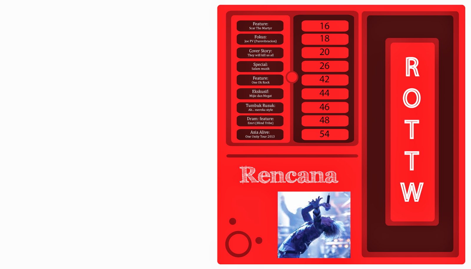
So this is our cover page idea, where we design the pedal board as the main image of the content page. From what we discussed, we planned to put each pedal containing different section of the magazine. So how it looks like is that, the middle part of the pedal is the main topic in a section. From the buttons above, audience can swipe through it to go to the other topics. As for the color scheme, we discussed and decided to put the colors of hipster, which are faded colors.


Hipster color.
http://jakenewton.files.wordpress.com/2012/03/hipster-haven.jpg

Feedback from Mr. Razif: Should make the same topics to be unseen as viewers would prefer to view all the content instead of one by one. Probably can keep the pedal board design but maybe added only the highlighted topics only. As for the general topics, maybe that could be added below in a plain design instead, just like the typical contents page.


The next section (introducing section), like we mentioned in the previous post, we are doing on a parallax scrolling theme, which mean one page scrolling. For the first anchor, we are doing a fold in magazine. In a fold in magazine, it has two different visuals telling different thing but it can be seen in a page. It can be refer to: http://www.nytimes.com/interactive/2008/03/28/arts/20080330_FOLD_IN_FEATURE.html?_r=1& . 
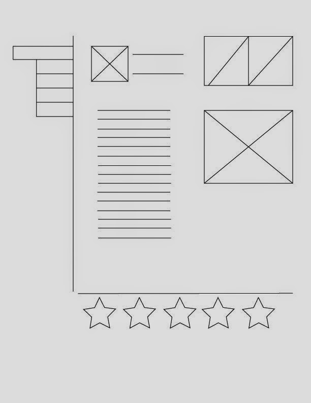
We will start on the shorter version -where we will put the original idea (the vector image of the featured artist) then when opened it will be the biography of him/her.


As we scroll down, we will have an anchor showing the artist's gear and instruments. There would be a tab for different categories and each will shown only two of the item. This, the audience can swipe horizontally to view more of the gear. After that, a video is shown if it is swipe down.

Mr. Razif's feedback: Maybe have an alternative if the fold in is unable to be produced using the software that we learned. Also, have the video that is shown be more interrelated to the gear/instrument showns. This is because some people is interested in certain things, that's why they even bother reading it.

Solution:
Amir thought that maybe an introduction of the gear/instrument will have it's own video where the reader can scroll if interested. If not, they can just scroll towards another and view the other's video instead.


Us when we are consulting Mr.Razif.

Monday, 7 April 2014

Proposal presentation

Today is the day where we first propose our ideas to the client. We managed to do the wireframe of our idea layout before the presentation.

  For our front cover, we proposed that the first image will be static while the background image will be  animated. When first loaded the magazine, the texts of the magazine will be animated into the page.


                                         Reference : http://africageographic.com/safari/#10/1


We planned to make the content page in a pedal board structure where the contents will be written in the rubber part of the pedal. As for the bigger pedal, we were thinking of making it into where the editor's note or anything important there. Each of the topic are to link to its related page when tab.


Sketch & wireframe

As for our lyrics / chords section, we planned to put the lyrics and chords in the middle since it is the main feature of that section. On the side of the page, reader can change the tab where it all differentiate in songs. The small box in the middle would be the album cover and beside it will be the result of voting poll by both critics and public. The song and lyric will have an auto scrolling while the lyrics will be highlighted according to the flow of the song. To make it easier for readers to catch up / read the notes easier, there will be a divider and a pop up tab will appear if double tab on it. Also there will be a video tutorial too. At the end of the song, the reader will be able to vote whether they loved the song or not.


Sketch & wireframe

For the introduced page, it would be a parallax scrolling page. That way, we get an interactive yet eye catching ways to attract the readers. The first part of the page will be the 2D vector design of the featured artist and then come along with his biography. After that is the instrument he used and his gears. Here we can have a short sound animation of how it sounds like when tab.


Friday, 4 April 2014

A more in-deph research

Today we had a discussion session where we write down the possible question that will be asked in the reader's point of view so that we can easily concentrate into our solution in making the product more successful.

The questions that we have come up with and has been run through by Mr. Razif are:

- How to make the chords easier to learn especially if there are beginners among the reader?

- What are the chords can we put in besides guitars?

- What interactive elements can we add to make the content more interesting?

- If we had a voting poll for the featured song, would you prefer the opinion of the public or from a industry professional?


Also, we learned at class today is the creative method for brainstorming: SCAMPER

S - substitute
C- combine
A- adapt
M- modify
P- put it other purpose
E- eliminate
R- reverse